Solutions
FOR BUSINESSES
Asset Link
White-labelEmbed branded verification flows directly in your platform. Your look, our infrastructure.
Verify Portal
EasiestSend verification requests by email — like DocuSign for crypto. No integration needed.
API
DeveloperProgrammatic access to trigger verifications. Full control, no UI required.
Frontyr
24/7 BankingEnable 24/7 money movement with stablecoins and digital assets.
FOR HOLDERS
Prove
Generate cryptographically-verified statements for your Bitcoin and digital assets. Sign a message, get a verifiable proof. No private keys ever shared.
Get your statement
FOR BUSINESSES
Asset Link
White-labelEmbed branded verification flows directly in your platform. Your look, our infrastructure.
Verify Portal
EasiestSend verification requests by email — like DocuSign for crypto. No integration needed.
API
DeveloperProgrammatic access to trigger verifications. Full control, no UI required.
Frontyr
24/7 BankingEnable 24/7 money movement with stablecoins and digital assets.
Designing What “Be Your Own Bank” Looks Like
Hi, I'm Erik, the lead product designer at Hoseki. I want to share how we approached designing our hardware wallet connection flow — the UX thinking, the product decisions, and how we worked to make something inherently technical feel intuitive.
Hoseki lets you prove you own Bitcoin without moving it, selling it, or exposing your private keys. You connect your hardware wallet, sign a message to cryptographically verify ownership, and get a statement you can share with lenders, counterparties, or financial institutions. Your coins never move. You stay in full custody.
We do this primarily through message signing. Message signing is native Bitcoin functionality, but it's not something most people have ever done. It's an unfamiliar flow involving a physical device, technical concepts, and screens that don't always feel connected to each other. So we had to design something that guides users through a process they've rarely encountered, without hiding what's actually happening.
Here is how we approached abstracting away message signing for proof of ownership for both single signature wallets and multisignature wallets.
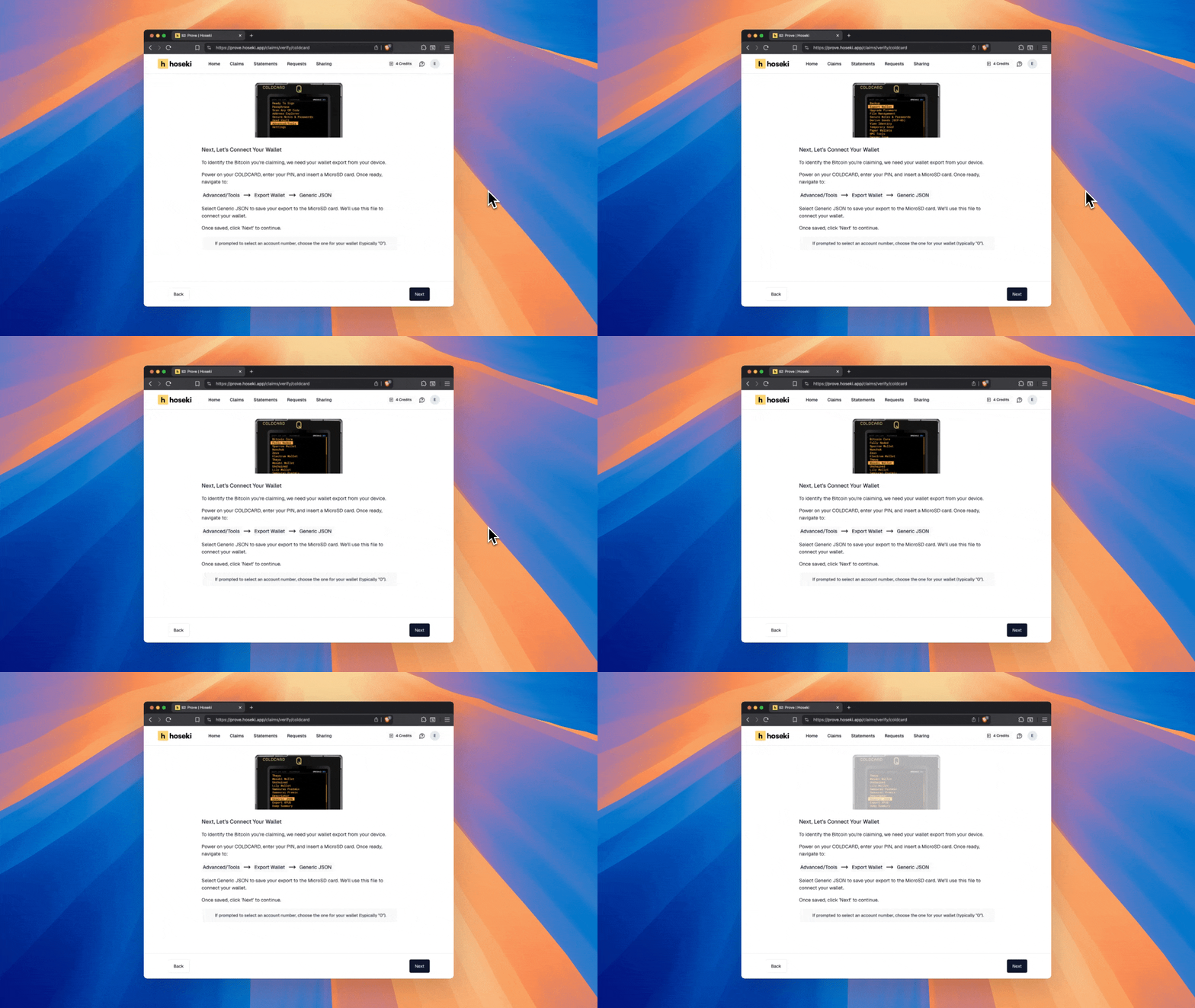
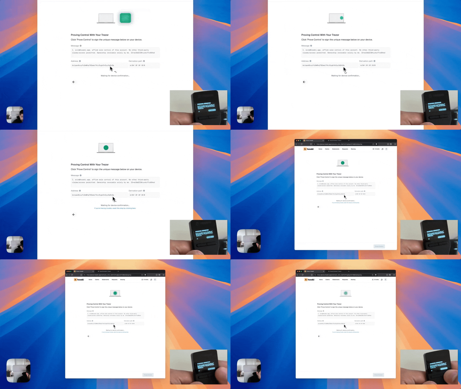
Watch: Connecting a Single-Sig Wallet (Detailed Breakdown)
A few key design choices helped make this complex process feel simple.
Bridging Screen and Device
Hardware wallets can feel disconnected. You're looking at a screen but holding a physical device. We added animations that show exactly how to interact with your device at each step, so you always know what to do when working with your hardware wallet. Hunting through a wall of text for the right sequence of button presses is not a pleasant experience. The best instructions are often no instructions at all, just a clear animation showing exactly where to go.
Verify Before You Sign
When we ask your hardware wallet to sign a message, it displays the address and message on its screen. But if you've never done this before, it's unclear what you're supposed to check. We mirror that information on Hoseki's screen at the same moment. You see the exact address and message we're asking you to sign, so you can confirm it matches your device. This is a core principle of hardware wallet security: never blindly approve what a website asks you to sign. By showing both sides, we make that verification step obvious.
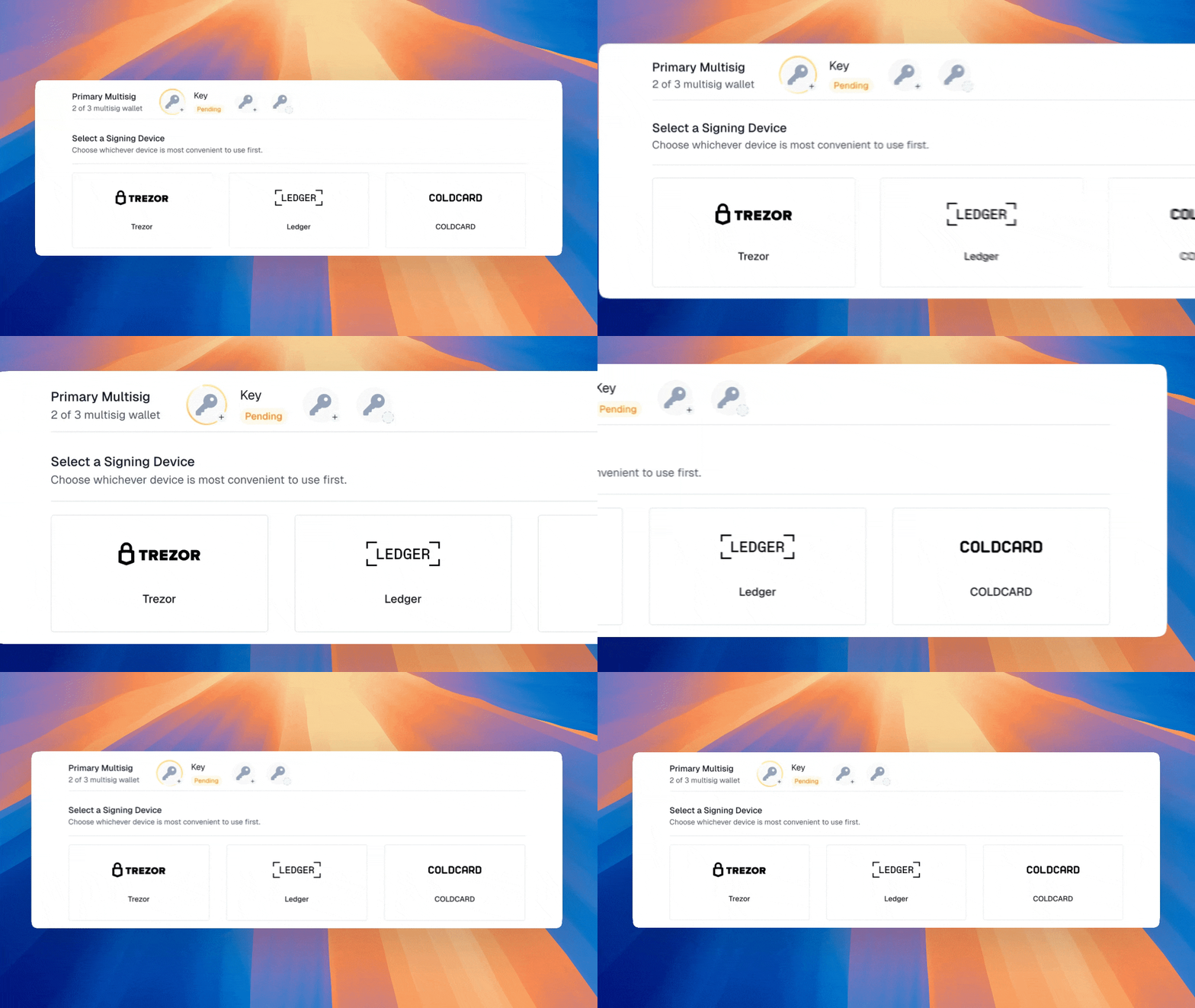
Watch: Connecting a Multi-Sig Wallet (Detailed Breakdown)
Multisig adds another layer of complexity. Instead of verifying one key, you're verifying multiple keys that together control a single wallet. Each key might live on a different device, and users need to understand where they are in the process at any given moment. The UX challenge was making the state of a multi-key quorum feel clear and trackable.
Key Avatar Indicator
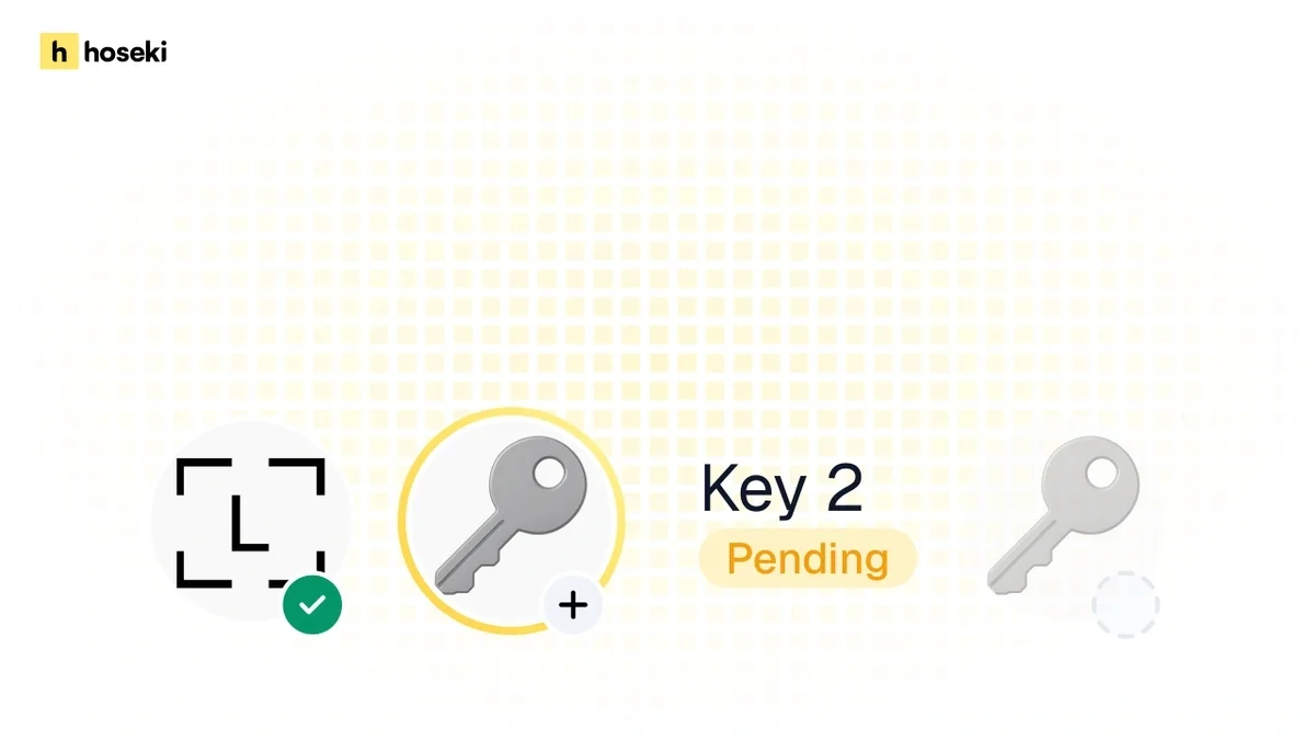
When a user identifies a multisig, we create a visual representation of each key as an avatar. A rotating yellow gradient ring indicates which key is currently active. We revisit this pattern of using a key avatar with a status indicator in other parts of Hoseki.
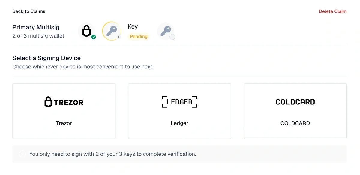
After a key is verified, its avatar updates with a green checkmark. The next key in the quorum is then highlighted in yellow. At a glance, you always know which key you're working on and what its status is.
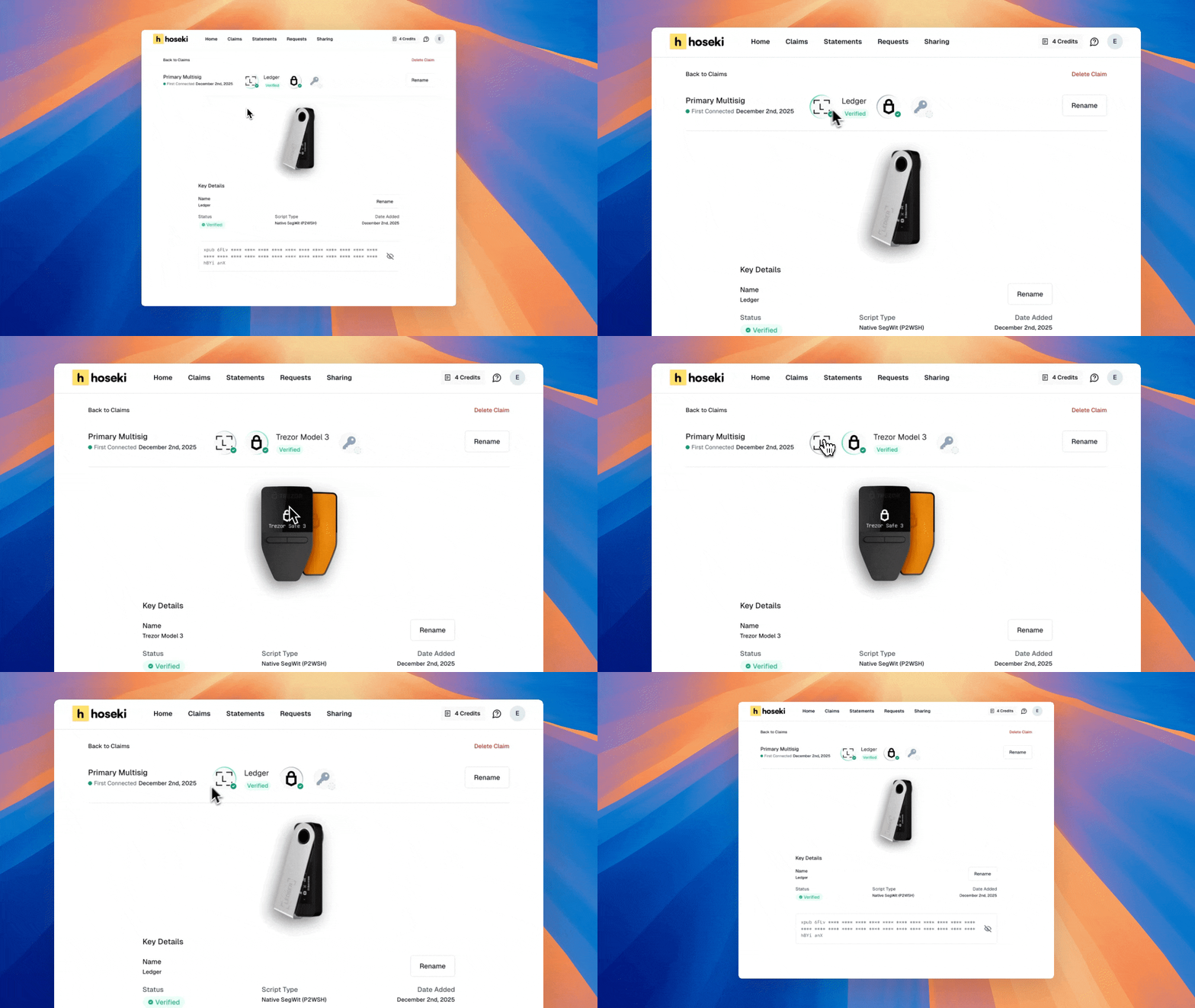
This pattern carries through to the claim details screen. Once a multisig claim is fully verified and connected to your account, you see the same key avatars, status rings, and can switch between keys with a click. Consistency builds confidence.
Designing Confidence
Our goal is to make verifying Bitcoin ownership feel intuitive and satisfying, even for someone who rarely touches their hardware wallet. Every animation, every status indicator, every screen was designed to remove friction and help you understand what's happening at each step.
If you want to try Hoseki yourself, head to hoseki.app, and if you have feedback, I'd love to hear it. Get in touch: erik@hoseki.app.
